Branding for the Ethereal
With MetaEnergetix we were given the amazing opportunity to not just design one logo, but two. In this project we explored a wide range of ancient and modern healing and spiritual practices to create two unique logos that create a unified identity.

MetaEnergetix
For the Parent company logo we focused on sacred geometry to create a logo that feels tactile and rooted in meeting. The logo was designed using the principles of Zenith Omega healing practices and the symbolic meanings behind Sacred Geometry to create a talisman that conveys femininity, energy, and rebirth.
A Cohesive Story
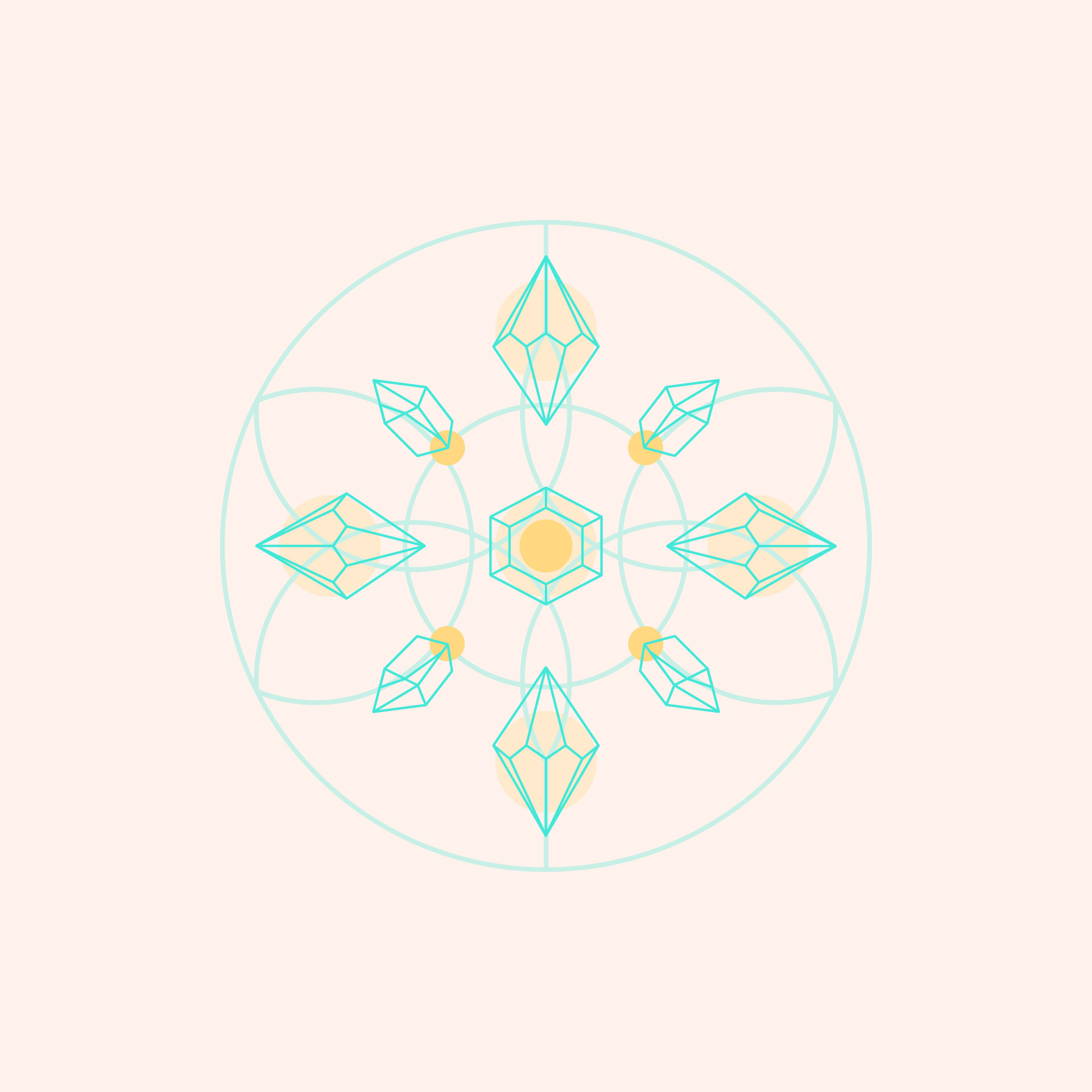
For CrystalEnergetix, just like MetaEnergetix, we wanted to keep everything rooted in sacred geometry, while ensuring that the crystals were the dominant visual. So, we used the previous logo as a grid for the crystals to be laid on. This came from the practice of crystal grids, which are geometric grids designed to be used in crystal healing sessions. This allowed for the two logos to come together in a cohesive way that tells an intimate story consumers can relate to.

CrystalEnergetix
With the grid laid out we focused on bridging the gap between organic shapes and geometry to make aesthetically pleasing crystals that had grounding in practices. This logo highlights the energy of crystal healing and the structure behind it.